What cottagecore actually looks like (and where most rooms go wrong)
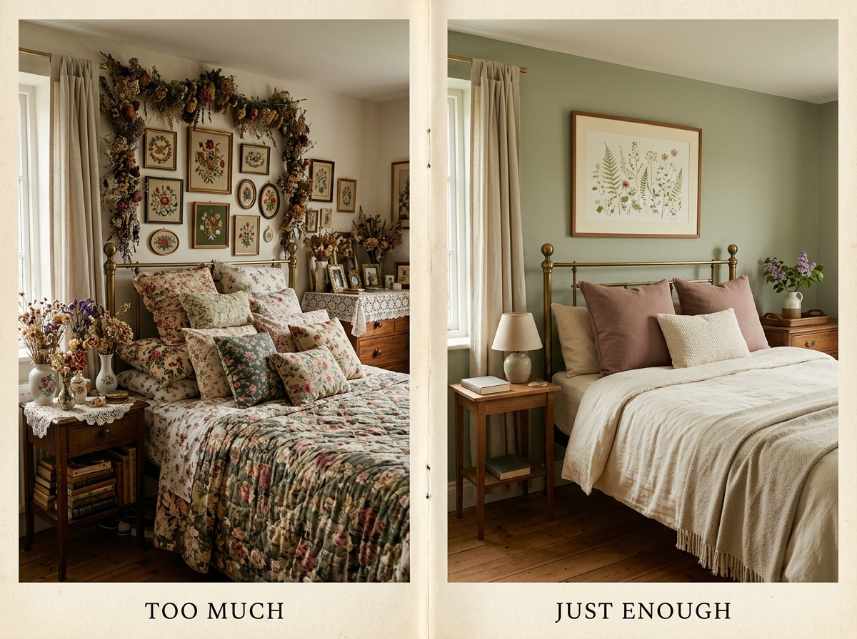
Cottagecore at its best is muted, layered, slightly imperfect, and warm. The botanicals are restrained, not loud. The textiles are mixed weights (a heavy linen with a fine cotton, a chunky knit throw against smooth bedding), not three patterns from the same craft store. The whites read as warm cream or off-white, never bright. There’s usually one or two vintage-feel objects in the room: a small lamp with a fabric shade, a ceramic vase, a stack of cloth-bound books. The whole thing breathes.
The way rooms go wrong is by over-keyword-matching. Twelve dried flower arrangements is not vintage. Eighteen pieces of needlepoint is not layered. A bed that disappears under nine pillows is not restful. The pattern in failed cottagecore rooms is always the same: every individual object is technically on-aesthetic, and the room as a whole is exhausting to look at. Cottagecore is the rare aesthetic where buying less of the right thing beats buying more of the right thing. The aesthetic is about quiet, and quiet doesn’t crowd.
The four renter-safe levers that do most of the work
The bedroom transformation, with no paint and no wallpaper, sits on four levers. The biggest one is wall art, which is also the most renter-friendly because it goes up with one nail or one Command strip and comes off cleanly at lease end.
- Wall art. One large piece above the bed (24×36 inches is the safe minimum at standard ceiling heights) or a small considered set on the opposite wall. This is the lever that decides whether the room reads as cottagecore at all. Get this right and the rest gets easier; get it wrong and the textiles can’t save you.
- Textiles. Bedding in a warm cream or sage or muted dusty pink. One textured throw at the foot of the bed in a complementary tone. Curtains in a fine cotton or linen, hung high and wide (the rod can go with you). Three textures, two tones, no third pattern.
- Lighting. Warm bulbs only, 2700K or lower. A bedside lamp with a fabric shade, plus one second light source (a small floor lamp or a string of small warm bulbs along the wall). No overhead light after dusk if you can help it.
- One vintage-feel object. A small ceramic vase. A cloth-bound book stack. A pressed-flower frame. One, not five. The point is that the eye lands on it and registers “old in a good way” before moving on.
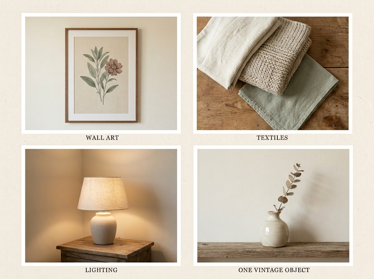
The four together set the room. The bed makes sense because the wall above it makes sense. The light is warm enough to forgive the rental beige. The single vintage object reads as intentional. Total renter cost, if shopped patiently across a month, is well under $200, and the wall art and textiles travel with you to the next place.
Anchor with art: two cottagecore-aligned collections
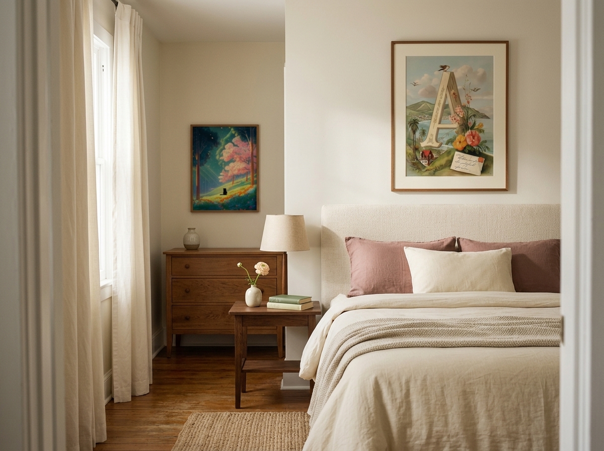
The art lever is the one that decides whether the bedroom lands. Two collections at alexneohome.com sit cleanly inside the cottagecore vocabulary, and they cover the two ends of the aesthetic that work together in one room.
Vintage Garden Letters is the formal cottagecore anchor: 53 Victorian botanical monograms, painterly, restrained. A single large piece above the bed (the monogram of your initial or your partner’s, sized at 24×36 inches or larger) does the whole heavy-lift of declaring the aesthetic. The print is detailed but the composition is calm (one strong central element with quiet botanical work around it), which is exactly the visual rhythm cottagecore needs above a bed. Cream mat, thin wood frame, hung at standard eye level over the headboard.
Black Cat in the Woods is the witchy-folksy cottagecore counterweight: 39 fantasy painterly pieces, woodland scenes, slightly darker register. Where Vintage Garden Letters reads formal, Black Cat in the Woods reads narrative. A smaller piece (16×20 inches) on the wall opposite the bed, or as a single piece in a reading corner, completes the room without crowding the bed wall. The two collections together cover the formal-and-folk axis of cottagecore that most renters try to get from a single piece and never quite reach.
Both collections sell as digital downloads at 300 DPI in five size ratios, which means the same artwork can become the 24×36 anchor for this apartment and a 16×20 for the next one. The bundle discount auto-applies at 3+ artworks (30%) and 5+ (50%), so a pair from each collection lands inside the four-lever budget without breaking it.
What to leave alone
The last move in cottagecore is the hardest, which is leaving surfaces empty. The dresser top should hold the lamp, the vase, and one cloth-bound book or one ceramic plate. That’s it. The nightstand should hold the second lamp, a small dish, and a book. That’s it. The wall opposite the bed gets one piece of art and one piece only. The corner of the room gets a chair or a basket of folded linens, not both.
A cottagecore bedroom that’s still working three months in is a bedroom you didn’t add to in months two and three. The room is restful because there’s room around each object for the eye to rest. The first apartment I tried to do cottagecore in, I kept buying small “perfect” objects for six months and the room got progressively less restful with each one. The fix was a slow editing pass that returned the room to seven objects from eighteen. Restful came back the moment the surfaces did.