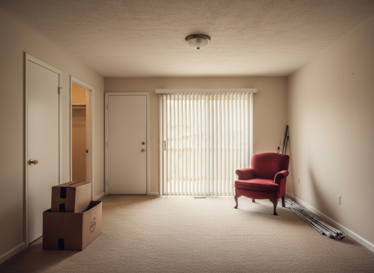
Mid-century modern was designed for renters. The low, leggy furniture that defines the style was built in the 1950s and 60s to fit the small starter apartments and ranch homes working families were renting at the time. Same square footage as a modern mid century modern apartment rental. Same low ceilings. Often the same beige carpet, because beige carpet is a 1960s invention. The style we keep buying back was originally built to live in the kind of spaces we now feel apologetic about putting it into.
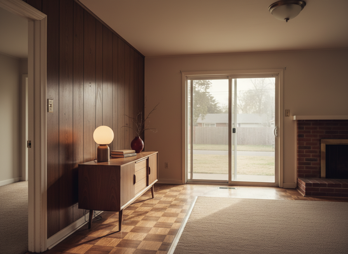
I lived in a 1960s ranch rental once where the previous tenant had left a walnut sideboard pushed against the painted-over wood paneling. The landlord hadn’t bothered to remove it before the showing. The sideboard sat there for a week before I touched it, and the whole time it looked correct in a way nothing I’d brought with me did. That’s when the framing flipped. Mid-century modern isn’t a style you bring into a beige rental. It’s the style that beige rental was originally dressed in. You’re not translating it. You’re returning it.
The four shapes that make a rental read mid-century
If you scrape away the Pinterest noise (the brass-legged knockoffs, the sage velvet anything, the “MCM-inspired” boucle armchairs that have nothing to do with the era), the actual style runs on four shapes. Get these right and almost any other choice will read correctly. Get these wrong and a $4,000 lounge chair will still look like a hotel lobby.
| Shape | What it does in a rental |
|---|---|
| Low and leggy furniture | Raises the visual floor. A sofa that floats six inches above the carpet on tapered legs makes a small room read taller than the same sofa flush to the ground. Renters get the small room for free; the legs are the trade. |
| Warm wood tones (walnut, teak, oak) | The era’s signature. Warm wood reads against beige carpet the way warm wood reads against nothing else; the two tones agree. Painted black metal everywhere will fight the floor. |
| One color hit per room | Mustard, teal, burnt orange, or olive. Not three. The era ran on a single accent against neutral wood and fabric, which is the same logic as the 60/30/10 color rule applied with discipline. |
| Straight lines, no fuss | No carved feet, no skirts on sofas, no tassels, no rolled arms. The era was a reaction against fussy postwar revival furniture. Pieces that look like they were drawn with a ruler will sit next to each other quietly. |
That’s the full grammar. Everything else (the credenza, the globe lamp, the framed graphic poster) is just vocabulary built on those four shapes.
Beige carpet is closer to the original than you think
The mid-century modern apartments on Instagram all have gray engineered hardwood under the walnut. That’s a 2020s read of the style, not a 1960s reality. The actual 1960s palette ran on cream, tan, oatmeal, olive, mustard, and burnt orange. The floor under a real walnut credenza in 1962 was often wall-to-wall beige berber, dark parquet, or a low-pile oatmeal carpet. The current beige carpet in your rental is closer to the original than the gray-floor version you’re being told is correct.
The renter advantage here is that you don’t have to fight the floor. You can’t paint the carpet, you can’t rip it up without a deposit war, and you almost certainly can’t replace it with the engineered planks in the moodboards you’ve been saving. None of that turns out to matter. Beige carpet sat under the original Eames credenza in the original 1962 ranch house. You can put a walnut sideboard directly on it and it will look correct.
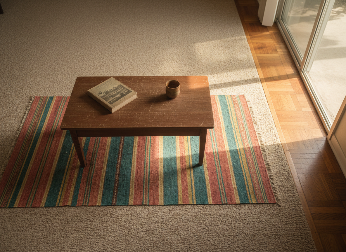
A small kilim under the coffee table is enough. The beige does most of the work.
If the carpet feels too neutral on its own, add a small low-pile rug under the coffee table only (not under the sofa, not floating in the middle). Something with rust, mustard, or olive in it. The rug doesn’t need to cover the room. It needs to give the beige a partner so the eye reads the two together as intentional. One small rug, one color hit, done. The rooms that look most like the era are the ones doing the least.
Putting this into practice for a specific room (which walls, which pieces, in what order) is the work a planning kit does better than another moodboard:
What to skip (the algorithm is wrong about MCM)
The mid-century modern category on Instagram has drifted, and the drift is what’s making renters spend money on pieces that won’t earn their place. A short, opinionated list:
Skip brass-legged anything. Brass-legged side tables, plant stands, bar carts. None of it is mid-century. Brass legs are a 2020s revival affectation grafted onto the silhouette. Real MCM legs were tapered solid wood or matte black tubular steel. The brass piece in your cart looks correct on the website and immediately wrong in a 1962 ranch envelope.
Skip the Eames-knockoff lounge chair if you can’t actually sit in it. The shape is iconic; the cheap version is a back-shaped torture device. A real Eames Lounge runs into four figures used, and the $300 knockoffs are uncomfortable in a way that broadcasts their price. Better to spend the $300 on a real walnut nightstand and live without the chair for a year.
Skip the museum-print mid-century poster. The generic Bauhaus shapes-on-pastel print every shop sells under “MCM wall art” is a tell that you bought the category, not a piece. Real MCM apartments had concert posters, travel posters, framed graphic art from working illustrators. Thrift stores carry the real version for $8. How to choose wall art covers the room-by-room logic.
The two pieces that carry 70% of the look
If you do nothing else, do these two. A low credenza or sideboard on tapered legs, 60 to 72 inches long, in walnut or teak. And a warm globe table lamp with a milky glass shade, sitting on top of it. The credenza grounds a wall without crowding it; the lamp gives the wall above it the soft, low pool of light the era ran on, instead of the cold overhead glare of a builder-grade ceiling fixture. Together they create a single, complete vignette that reads correct from across the room — even when nothing else in the room has been updated yet.
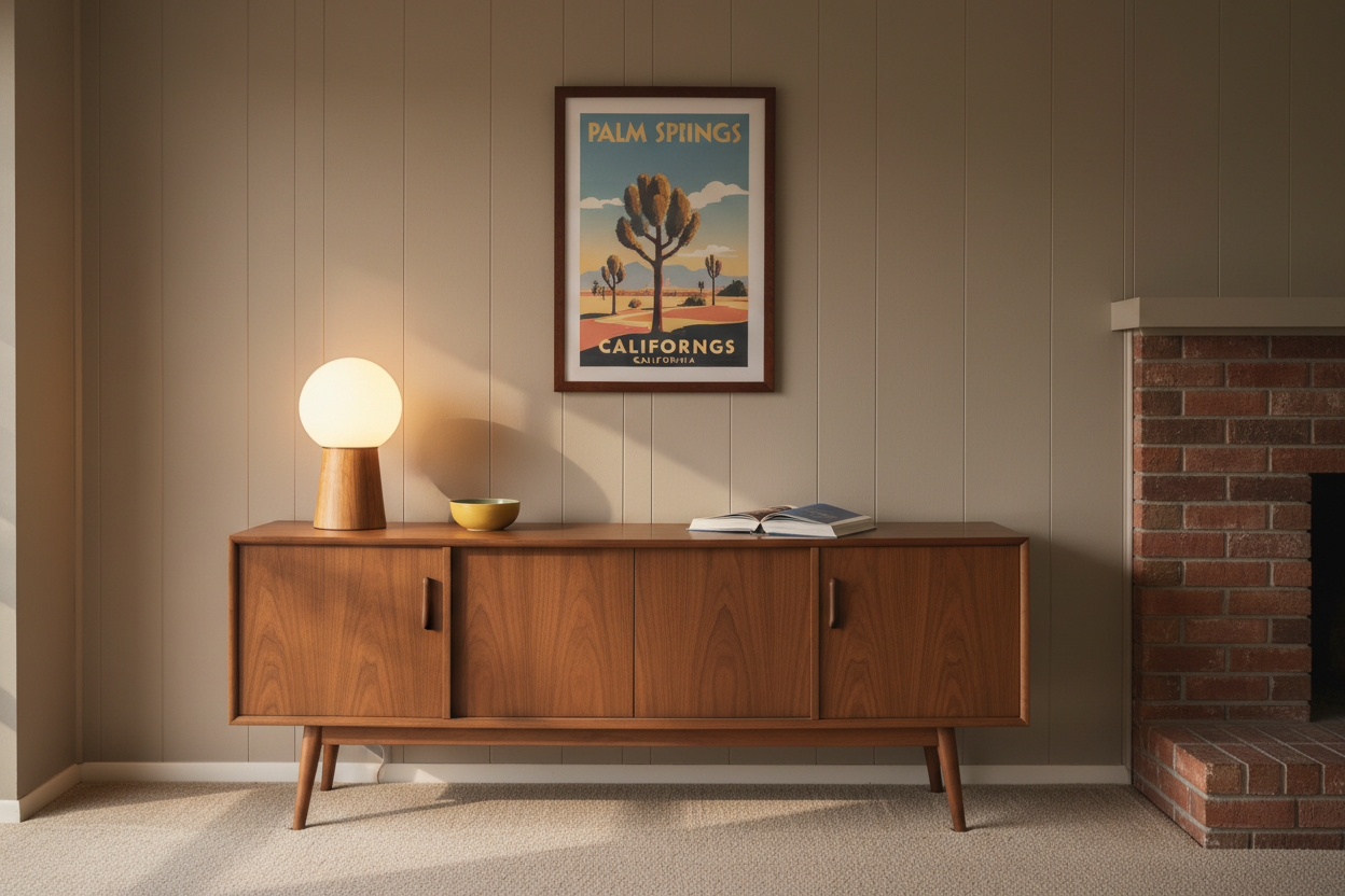
Credenza, lamp, one framed piece above. The painted-over paneling stops being a problem.
Both pieces sit in the renter price tier. Vintage walnut credenzas run $200 to $400 on Facebook Marketplace and Craigslist. New milky-glass globe lamps run $40 to $90; the vintage ones at thrift stores cost less. The complete vignette can land under $500 and stop the room from reading like a rental at all.
The walnut sideboard the previous tenant left in that 1960s ranch is still in my head as the moment a rental can read like it was decorated on purpose, even when most of the room hasn’t been. I put a globe lamp on it the day I moved in. That was the room from then on.