The standard way to find your aesthetic is a personality quiz that ends with a brand archetype. Twelve questions about your morning coffee and the way you fold sheets — and the result is “coastal grandma” or “dark academia” or “modern eclectic.” Then you’re meant to buy art that matches the label.
This works backward. Your aesthetic isn’t a personality you discover and then dress to match. It’s the visual world your room already lives in: the wood tones in the furniture you didn’t pick, the 4pm window light, the screenshots in your camera roll you’ve never read as a pattern. The right way to find your aesthetic wall art collection is to look at what’s already in the room, not at what a quiz thinks you are.
How to find your aesthetic without a personality quiz
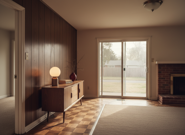
Three observations to make before you open any shop page. One: look at the wood tones already in the room. Warm wood (walnut, teak, oak in honey finish) wants warm art: botanicals, storybook scenes, hand-painted anything with earth tones in it. Cool wood (gray-stained, painted black, no wood at all) tilts toward graphic, line-art, or moody work. The wood you didn’t pick out tells you more than any quiz answer.
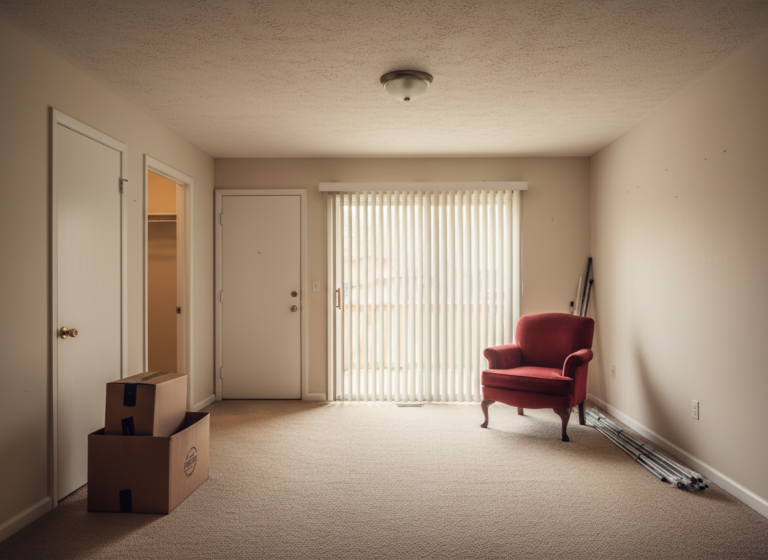
Two: look at the light. Warm afternoon light from a west-facing window forgives a lot; it makes muted art look richer than it is. Cool morning light from a north-facing window flattens everything, and art in that room needs to bring its own color. Apartments with one good window and three bad ones almost always want their art on the wall the good window is lighting.
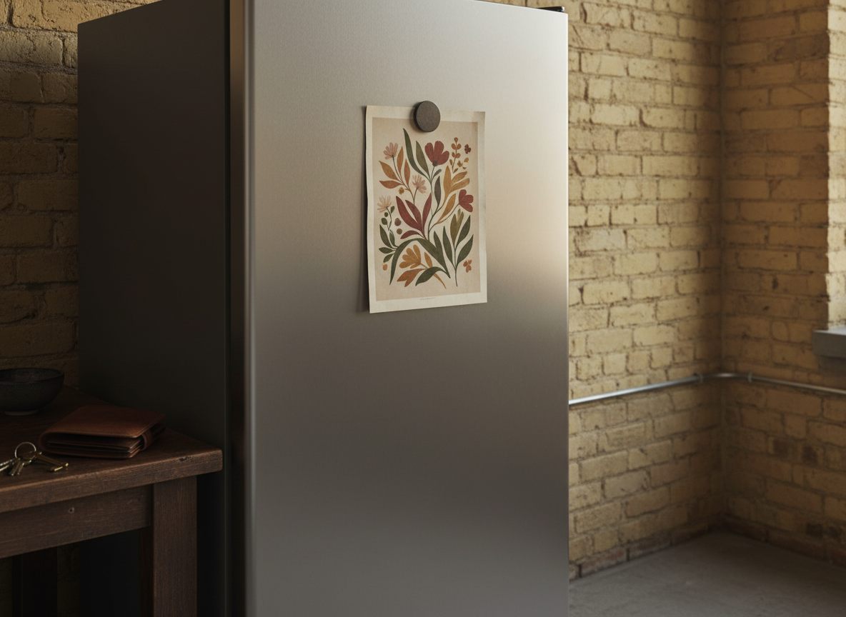
The fridge tells you more than the quiz. Whatever you’ve already saved is the pattern.
Three: look at what you’ve already saved. Pinterest boards, screenshots, photos from a friend’s apartment that you took without saying why. There’s almost always one repeated thing in the pattern: a color that keeps coming up, a subject that keeps catching you (always animals, always botanicals, always cities). That repeated thing is your aesthetic, and you already know what it is.
For the structured version, the interior design style guide walks through ten named styles. The aesthetic quiz is the fast version. Both are shortcuts; neither is necessary if you already trust what the room and the camera roll are telling you.
The 12 collections, sorted by the room they belong in
Twelve collections, sold as printable JPGs at 300 DPI. Bundle pricing auto-applies: 30% off three, 50% off five, 65% off ten, which makes a small cohesive gallery cheaper than two individual prints. The collections below are sorted by which room and which mood they fit, not by which one sells the most.
Storybook & cottagecore: for warm-toned living rooms and bedrooms
Four collections of hand-painted, soft, faded nature scenes. They want a room where lamp light is already winning over overhead light.
Woodland Friends: soft storybook animals in muted tones. The safest entry point if you’re not sure where your aesthetic lands; it forgives most rooms.
Life Around Us: gouache cottagecore city scenes. Storybook softness on urban subjects, for renters who want warmth without going full pastoral.
Vintage Garden Letters: Victorian botanical monograms. Works as a single initial above a doorway, or a spelled-out word above a console.
Blooming Alphabet: folk-art floral letters. Same monogram logic as Vintage Garden Letters, but louder and more colorful.
Pets & playful: for nurseries, kids’ rooms, and pet lovers
Three collections built around animals. If you’d hang a framed dog above the sofa, these earn their place anywhere, not just a kid’s room.
Man’s Best Friends: whimsical illustrated dogs. Lives well in entryways, hallways, and any wall a dog person walks past every day.
Happy Tails’ Moments: watercolor pastel dog scenes. Nursery-coded, but also reads as a calm gift for a new dog owner’s apartment.
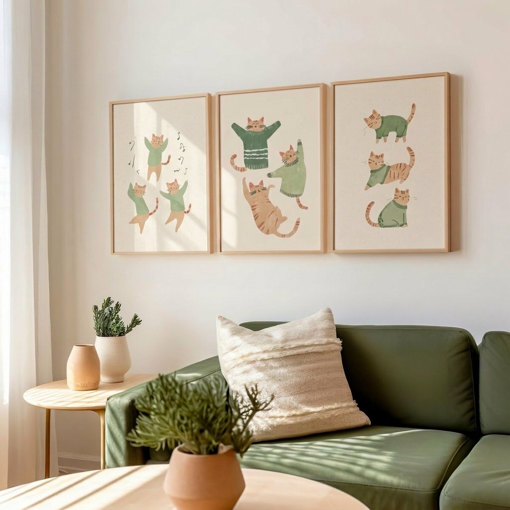
Matcha Cats Club: illustrated cats in sage and matcha tones. The biggest collection in the catalog; the volume lets you build a wall around a tight palette.
Warm kitchens, bars, and dining nooks: room-coded for cooking and drinking spaces
Two collections built for specific rooms. Landlord-grade cabinets and beige backsplash respond unusually well to a single warm piece.
Golden Bakery Mornings: warm watercolor bread, pastry, and coffee scenes. One framed piece above the counter changes a rented kitchen more than any other intervention I’ve tried.
Sip & Smile: hand-drawn cocktail and bar scenes in warm tones. For dining nooks, breakfast counters, or anywhere a small bar cart already lives.
Moody, gothic, dark academia: for atmospheric rooms with low light
Two collections that need a room willing to hold their weight. Bedroom or reading corner with one warm lamp, not a bright morning kitchen.
Midnight Arcana: gothic, symbolic, witchy. The smallest collection in the catalog, which works in its favor; a tight set of 17 means you can pick three and the room reads cohesive.
Black Cat in the Woods: fantasy painterly. The painterly finish gives it more living-room range than Midnight Arcana; not strictly gothic, more cinematic.
Bold, graphic, music-corner: for accent walls and modern rooms
One collection in its own corner. The graphic line-art style works best as a single statement piece against a plain wall, not a gallery.
Red Vinyl & Black Cat Club: bold line art on music subjects. The right answer when the rest of the room is quiet and one wall needs to do the talking.
If your aesthetic lands cleanly in one cluster, build there. If it sits between two adjacent clusters, pick one from each and see if they read as one family on the wall. The next question after “which collection” is always “how do I actually hang it”:
How to start: one piece first, then the rest
The expensive mistake is buying five prints at once, framing them, hanging them, and realizing on day three that the wall doesn’t move the room the way you thought. Now you’re holding $200 of frames you don’t want to take down, and you live with a wall you don’t love for a year.
The cheap right way: buy one print first. Frame it (a thrift frame works for the test), hang it on the wall you’ve already decided is its home, and live with it for a week. If you walk in and the eye lands where you wanted it to, you have your aesthetic. Buy the next three from the same collection (three at 30% off cost about the same as two individuals), frame them, and finish the wall.
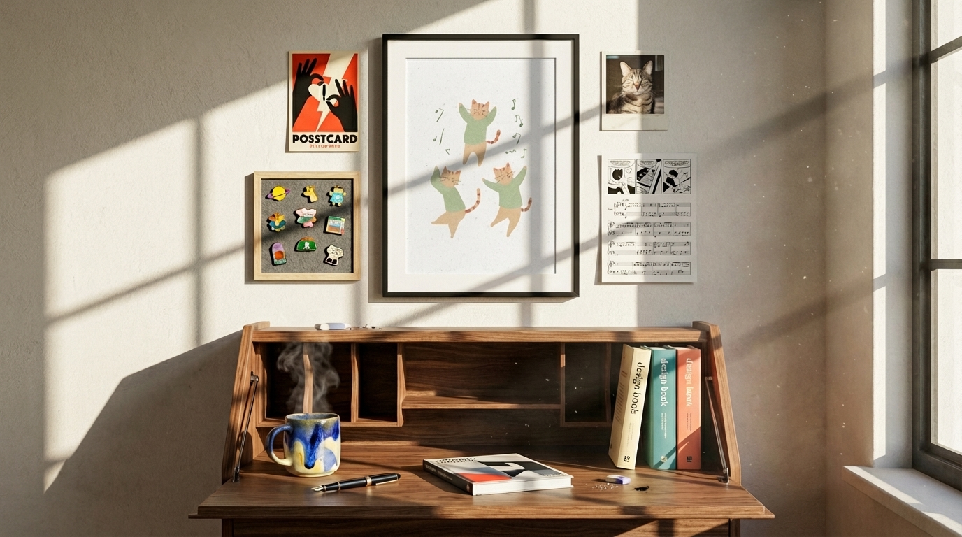
One print first. The pencil mark for the next nail is the only commitment you’ve made.
If the room doesn’t shift the way you wanted, you’ve spent $6 to learn that the aesthetic you thought you wanted isn’t what the room is asking for. That’s the cheapest correction tuition you’ll ever pay. Take the frame down, save the print for another room, and try one piece from a different cluster.
The renters whose rooms end up looking most like themselves do this on a slow loop. One piece, hung, lived with, then the next. Over a year the walls fill out with a collection that reads as one decision instead of twelve.