Knowing how to choose wall art comes down to three things: matching the color palette, getting the scale right, and respecting the room’s style.
Choosing art feels high-stakes — it’s the most visible, most personal thing in your room. That pressure makes people either buy the first thing that seems “fine” (and it looks fine — not great, not personal) or buy nothing and live with blank walls for a year.
Simpler framework: art needs to match three things — your room’s colors, your room’s scale, and your gut feeling.
How to Choose Wall Art: Color, Scale, and Style
Look at your room’s existing colors. Your art should pull from those — not introduce entirely new ones. If you’re following the 60/30/10 rule, choose art that contains your 30% secondary or 10% accent color.
✅ Safe choice for any room: Black and white art or neutral-toned art (cream, beige, charcoal, warm gray) works in virtually any palette. If you’re unsure, start here.
The wrong art isn’t a mistake — it’s a missing framework.
The All-in-One Decor OS tools that apply directly:
Step 2 — Match the Scale
Art too small for the wall looks lost. Art too big overwhelms the space.
- Above furniture: Art or grouping spans ⅔–¾ of the furniture’s width. A single 8×10 above a 7-foot sofa looks tiny.
- On an empty wall: When in doubt, go bigger. A single large piece makes more impact than three scattered small ones.
Step 3 — Match the Style
- Minimalist / Japandi: Line drawings, simple abstracts, muted tones, nature photography in soft light
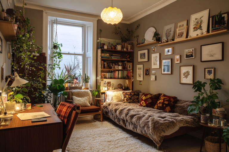
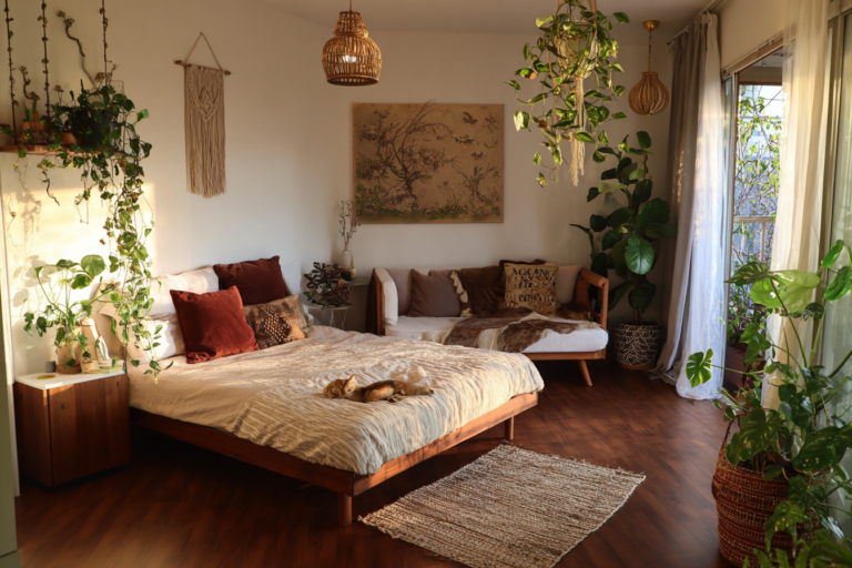
- Boho / Eclectic: Botanical prints, warm-toned photography, abstract art with texture
- Modern: Bold graphic prints, black and white photography, geometric abstracts
- Dark Academia / Moody: Oil-painting-style still lifes, dark botanical prints, classical art reproductions
Step 4 — Trust Your Gut (With One Rule)
Do you want to look at this every day? Art you feel neutral about will always look like filler. Art you genuinely respond to will make the room feel personal.
The one rule: If you love a piece but it doesn’t match your palette, still buy it — just make sure one of its colors appears at least 3 more times in the room. Three instances = intentional. One = accidental.