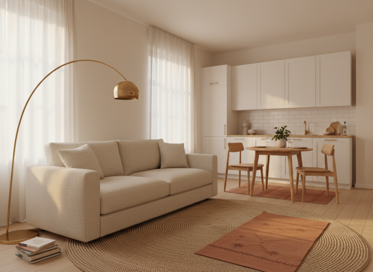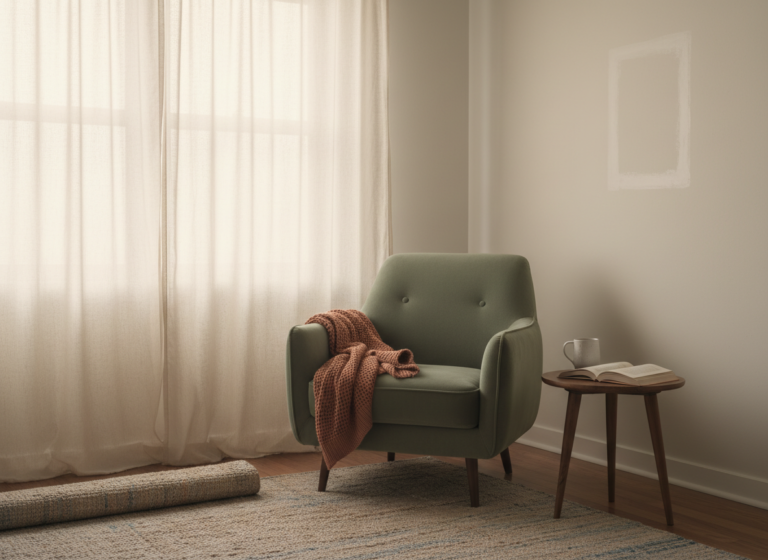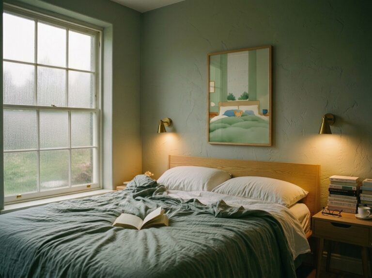

Two years ago I tried to make a roughly 500-square-foot studio look like the dark academia bedroom I had forty-seven pins of. The pins had built-in oak bookshelves, leaded windows, brass picture rails, and a decorative fireplace nobody was using. My studio had cream-painted plaster I wasn’t allowed to touch, one west-facing window with vinyl blinds, and a popcorn ceiling. By week three I’d spent $180 on amber-glass lamps and tweed throws, and the room still read as a college dorm in costume.
The mistake wasn’t the aesthetic. Dark academia is achievable in an apartment. The mistake was treating aesthetic room ideas as a list of objects to copy, when most of what makes those rooms work is architecture you don’t own. Aesthetic ideas that actually translate to renters are about which parts of the look the lease can support, which parts have to be faked, and which to drop without losing the feeling. Below: four aesthetics that translate cleanly, two that don’t, and the rules that adapt the rest.
Pinterest aesthetics are owner aesthetics in disguise
If you screenshot ten of your favorite saved rooms and circle every element that earns the look, about seventy percent of what you’ve circled is architecture. Wall color. Crown molding. Ceiling height. Wood flooring. Built-in shelving. Window trim. Exposed brick. The other thirty percent is what’s actually movable: textiles, lighting, framed prints, ceramics, plants, the occasional accent chair.
The renter version of any aesthetic is that thirty percent, in cleaner concentration. Not the seventy percent recreated cheaply with peel-and-stick wallpaper and fake wood beams. Faking architecture always reads as faking architecture. Concentrating the movable thirty percent, with fewer and more deliberate pieces, is what makes a renter’s room photograph the way the pins do.
The pin is 70% architecture and 30% objects. As a renter, you only have access to the 30%. Lean into it harder; skip the 70% entirely.
This is also the test for whether an aesthetic is worth pursuing in your current apartment at all. If you list the aesthetic’s signature moves and find more than half of them require permanent changes (wallpaper, paint, replacement flooring, new molding), pick a different aesthetic or wait for a different apartment. There is no cheap-fix architecture that looks like the pin.
Four aesthetics that translate cleanly to a rental
These four work because their signature moves are sixty to ninety percent movable objects. The architecture in the pin matters less than it looks like at first scroll.
Each aesthetic in its movable parts — what carries the look when the walls have to stay neutral.
Japandi. Mostly objects: low-profile furniture, paper lanterns, light wood, neutral textiles, one plant. Lease-friendly because the cream walls most rentals come with are already the base palette. Translation: low platform bed frame, one rice-paper floor lamp, a jute rug, a single sumi-ink print framed simply. Skip the engineered wood floor; carpet hidden under a large rug reads close enough.
Cottagecore. Mostly textiles, ceramics, and dried plants. Skip the cottage architecture you don’t have and concentrate the moves: gingham or floral curtains on two windows, ceramic pitchers on open shelves, dried hydrangeas in a glass jar, framed botanical prints in mismatched secondhand frames. Wallpaper is the cottagecore trap. Every cottagecore pin has it, and no rental version of it survives a move.
Dark academia. Treat it as a lighting and textile problem, not a paint problem. The pin’s “dark walls” do most of the work, but two warm-bulb lamps and a deep-toned area rug create the same room temperature. Stack of hardcover secondhand books, brass desk lamp, one tweed or wool throw, a single oil-painting-style print with a dark background. My second attempt at this, after the failed first one, was a corner of a beige rental that ended up reading more dark academia than the actual library reading room I’d been studying in.
Quiet luxury / soft minimalism. The accidental advantage of most rentals: beige walls. Quiet luxury rooms are seventy percent neutral walls already, which means the renter version is closer to the pin than the owner version. Translation: one boucle accent chair, layered cream-on-cream linens, an oversized framed print, brass or matte black hardware swaps where the lease allows. The aesthetic that suffers least from renter constraints.
Two that don’t translate cleanly: mid-century modern, where most pins lean on wood paneling, built-in cabinetry, or feature walls that don’t survive removal; and French country, which is heavy on architectural detail like wood beams, plaster textures, and paneled walls. Both can be approximated, but the gap between the pin and the rental version is wider than it is for the four above. If you’re still narrowing it down, our style-finding walkthrough covers how to pick an aesthetic that matches both your taste and the apartment you actually have.
Four translation rules that work across every aesthetic
Pick an aesthetic, apply these four rules, and the rental version starts to land. They’re the moves that recover from “I can’t paint, can’t drill, can’t tear up the carpet” without giving up the look.
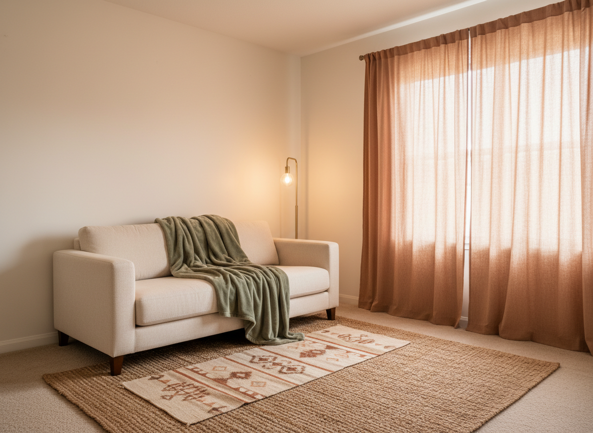
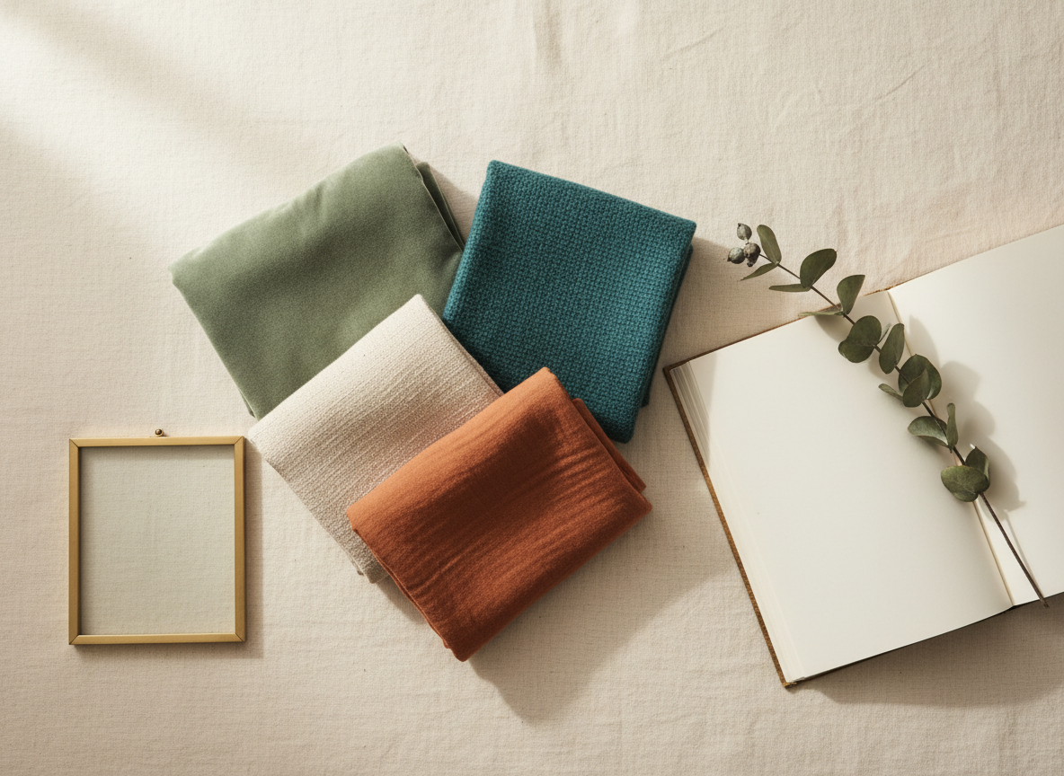
Rule 1 in action — textiles doing the visual heavy lifting before any wall ever gets touched.
The pattern in the photo above is the textile-blocks rule (Rule 1) doing most of the work. Once you can see what a single rule looks like in concentrate, the rest of the table reads as four small problems instead of one impossible one.
| Owner move (the pin) | Renter translation |
|---|---|
| Painted accent wall | Three large textile blocks in the accent color: a 5×7 rug, floor-to-window curtains, an oversized throw on the largest seat. |
| Crown molding / picture rail | One brass or warm-metal floor lamp arched into the room. The eye reads “framed ceiling” from the lamp’s curve. |
| Hardwood floor | Layered floor: large jute rug under a smaller wool or vintage runner. The texture mix reads as intentional flooring. |
| Built-in shelving / gallery wall | Three small framed prints in a row at eye level, hung with adhesive strips. Repetition does what built-ins do, telling the eye the wall was planned. |
The repetition rule is the one most renters miss. Pinterest aesthetics read as “designed” because the same color or shape appears three times in a frame: three brass objects, three picture frames in a row, three throws in adjacent tones. One of anything reads as an accident — three reads as the look. In a small apartment, three is also usually the maximum that fits, which makes it a budget rule disguised as an aesthetic one.
One aside that cost me a season to learn: the order of these rules matters. Add the textile blocks first (curtains, rug, throw), then the lamp, then the layered floor, then the wall art. Doing it backwards, buying the art before the curtains, is how you end up with the bare-walls-with-framed-prints look that doesn’t match any aesthetic at all.
Once you’ve locked in the aesthetic and you’re at the shopping stage, the search-keyword vocabulary changes too. Our aesthetic-to-wall-art map covers the ten most-searched aesthetics with the exact phrases that pull the right results on Etsy, Facebook Marketplace, and IKEA. Useful at the texture-and-print stage of the translation, when “cottagecore” is too broad and the algorithm needs the next word.