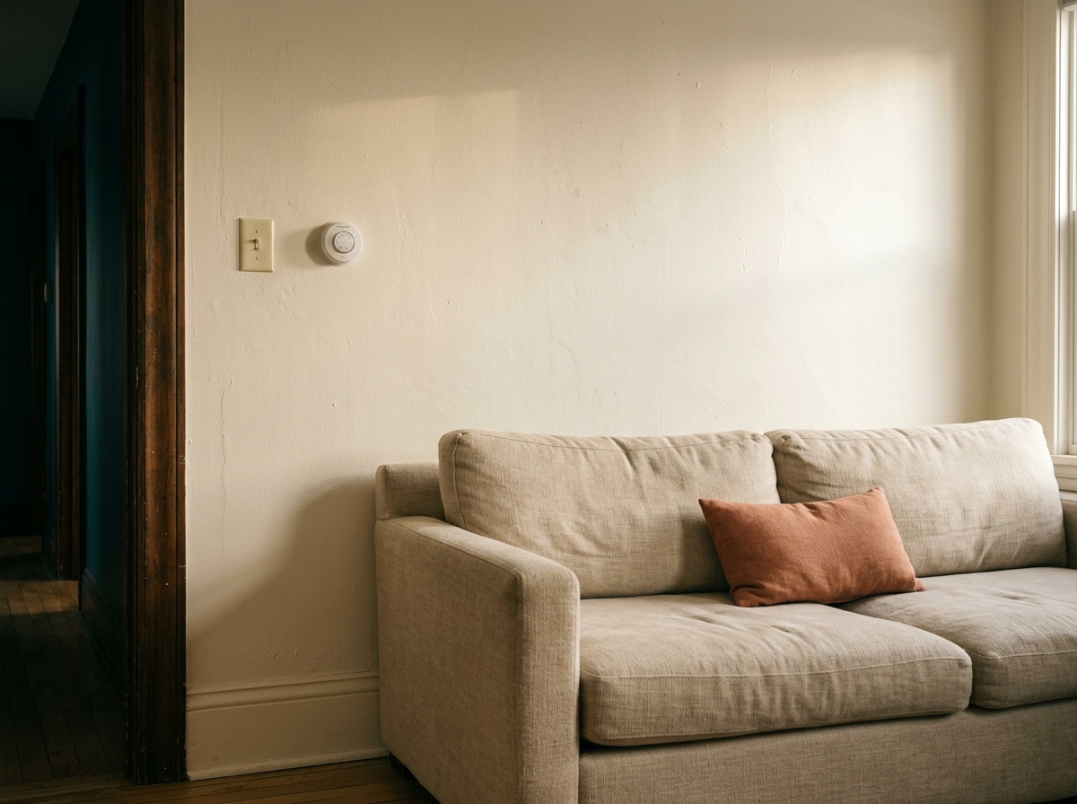
Every gallery wall guide starts the same way: pick a layout. Salon style, grid, asymmetric, ledge — laid out like outfits in a magazine, as if the wall is a blank canvas waiting to be styled. In a rental living room, the wall is not blank. It has a thermostat. It has a light switch at hip height, an outlet someone added in 1998, a baseboard heater you can’t move, and a sofa pushed against it because there’s nowhere else for the sofa to go.
The layout doesn’t pick itself. The wall picks the layout. Once you start there — what shape is the wall, what’s blocking it, what’s permanent — the four templates below are usually the only honest answers. I’ve used three of them in three different apartments. The fourth I learned the hard way after wasting an afternoon trying to force a salon cluster onto a four-foot wall.
Template 1 — The Long Sofa Wall (cluster, anchored low)
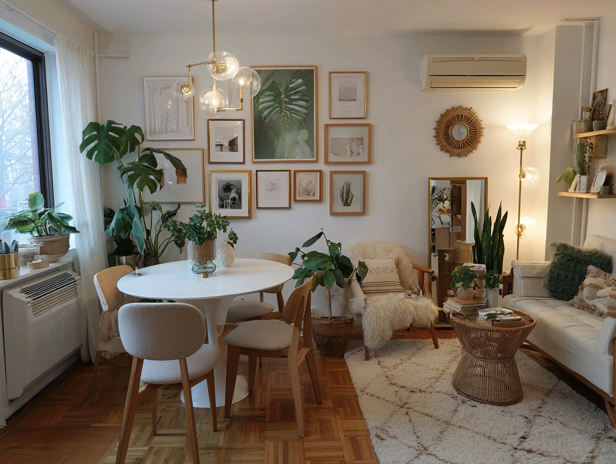
If the wall behind the sofa is 8 feet or longer and mostly uninterrupted, the salon-style cluster is the layout that earns its space. Six to nine frames in mixed sizes, arranged so the visual weight sits in the bottom two-thirds of the cluster. The center of the whole arrangement should sit 6 to 8 inches above the back of the sofa — closer than feels right at first, but the cluster reads as connected to the sofa instead of floating above it.
What this layout solves: a long wall can swallow a single big print. A cluster fills the space without committing to one statement piece, and the mixed sizes hide the fact that most renters don’t own a coherent collection — they own a handful of prints picked up over three apartments. The asymmetry is the disguise.
What it costs you: forty-five minutes of paper templates and painter’s tape on the wall before any nail goes in. Skip that step and you will end up with three holes in places you don’t want them.
Template 2 — The Broken Wall (tight grid, around the obstacle)
The most common living room wall in a rental is 5 to 7 feet wide, interrupted by a light switch, an outlet at the worst possible height, or a thermostat right where the eye lands. A salon cluster on this wall looks like clutter. A single big piece looks like the obstacle was never accounted for. A tight grid is the only layout that absorbs the interruption.
Four frames in a 2×2 or six frames in a 3×2, all the same size, all the same finish, 2 to 3 inches apart. The grid creates its own frame and the obstacle reads as outside the grid instead of inside the composition. Center the grid on the visual midpoint of the wall, not the geometric one — the geometric center will put a frame on top of the light switch.
Quick anchor: measure from the corner of the obstacle to the nearest wall edge. Center your grid on the larger of the two segments. The obstacle becomes negative space on one side, not a hole in the middle of your art.
Template 3 — The Narrow Strip (vertical stack, between two openings)
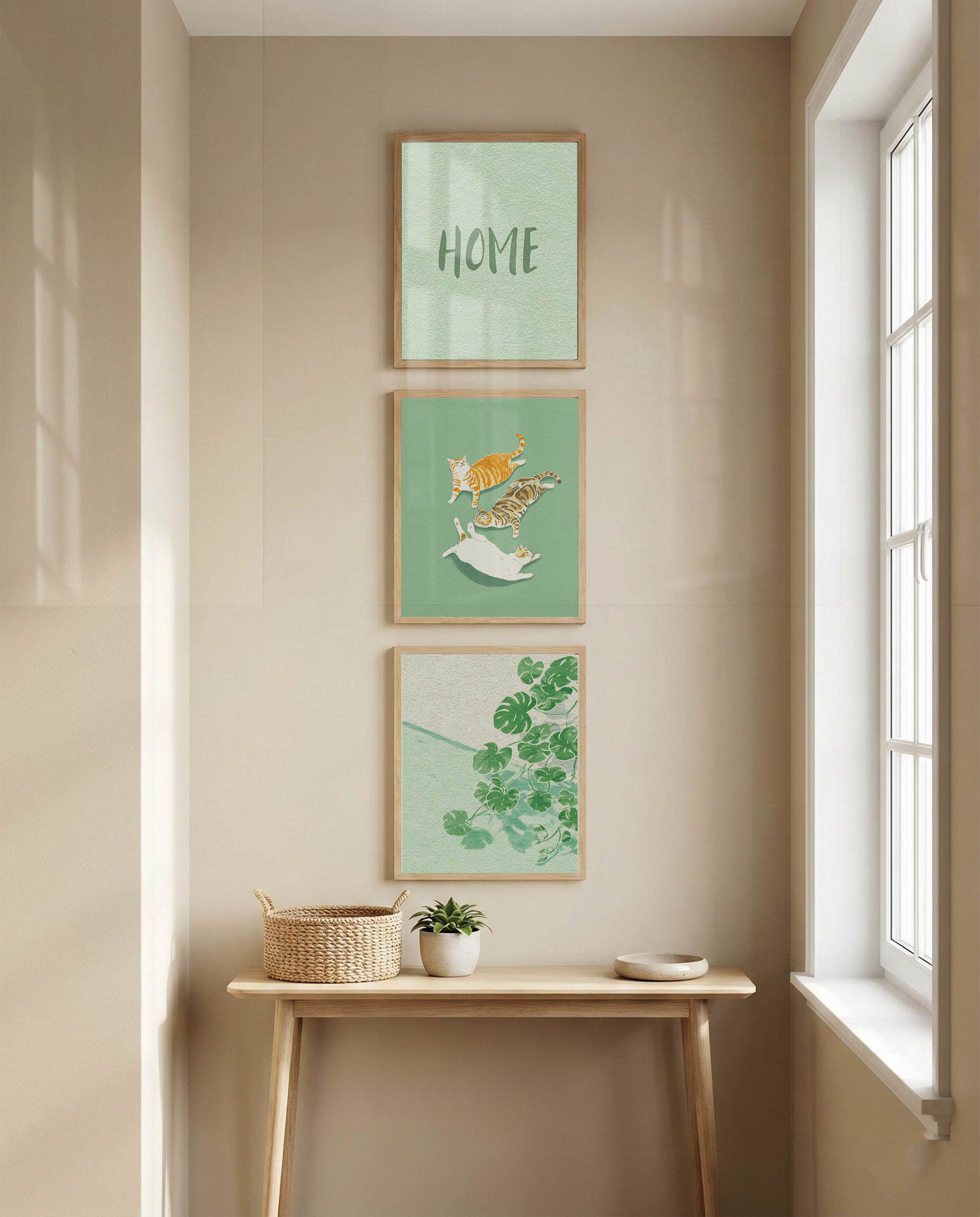
A lot of renter living rooms have a wall that’s really a strip: 18 to 36 inches wide, hemmed by a doorway on one side and a window on the other. Or two doorways. Or a doorway and a closet. The wall is too narrow for horizontal composition and too tall to leave bare without the room feeling unfinished.
Three small frames stacked vertically, same width, 2 inches of spacing. Top frame at roughly 60 inches center, working down. The stack reads as a deliberate column instead of an apology for the wall. If you only have one frame, hang it lower than instinct says — around 50 to 54 inches center — so it doesn’t float in the upper half of the strip with nothing to anchor it.
Template 4 — The Single Anchor (one big piece, lots of breathing room)
The fourth template is the one most layout guides skip because it isn’t really a gallery wall — it’s the deliberate refusal of one. When the wall has too many obstacles, or the room is small enough that more than one piece will fight the rest of the decor, a single oversized print earns the entire wall.
The piece should be roughly two-thirds the width of the sofa or sideboard below it. Center at 57 to 60 inches from the floor when there’s no furniture below; 6 to 8 inches above the back of the sofa when there is. The point is that the empty wall around the piece is doing work — it’s giving the room visual rest in a space where the eye otherwise has nowhere to land. Restraint, in a small living room, reads as intention.
| Wall shape | Template | Frames | Center height |
|---|---|---|---|
| Long, mostly clear (8+ ft) | Salon cluster | 6–9 mixed sizes | 6–8″ above sofa |
| Short, interrupted (5–7 ft) | Tight grid | 4 or 6 same-size | Visual midpoint, not geometric |
| Narrow strip (18–36″) | Vertical stack | 3 same-width | Top frame ~60″ center |
| Obstacle-heavy or small room | Single anchor | 1 oversized | 57–60″ or 6–8″ above furniture |

A living room gallery wall is a renter’s longest-running design decision. You’ll see it from the sofa every night for as long as you live there. Pick the template that matches the wall you actually have, not the one in the magazine spread.
One last thing nobody tells you about gallery walls in rentals: the holes you don’t make matter as much as the ones you do. Paper templates and painter’s tape on the wall, lived with for a full day, will save you a row of patch marks at move-out and a security-deposit fight you didn’t budget for. Forty-five minutes now, hours saved later. Pick the template, measure the wall, tape it up, look at it on a Sunday morning. Then hang.