You know that feeling when a room looks “pulled together” but you can’t explain why? Nine times out of ten, the colors follow a specific ratio — even if the person who decorated it never consciously planned it.
That ratio is 60/30/10. The simplest formula for color choices in any room without it looking random, clashing, or overwhelming. The 60 30 10 color rule is the simplest formula for making any room feel balanced — even if you’ve never studied design.
The 60 30 10 Color Rule Made Simple
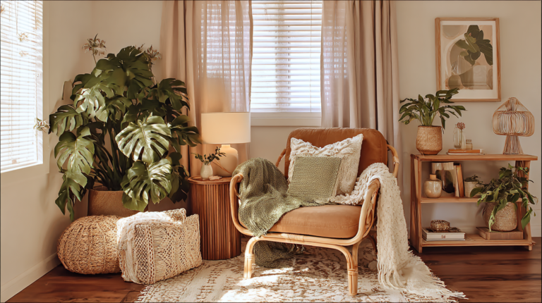
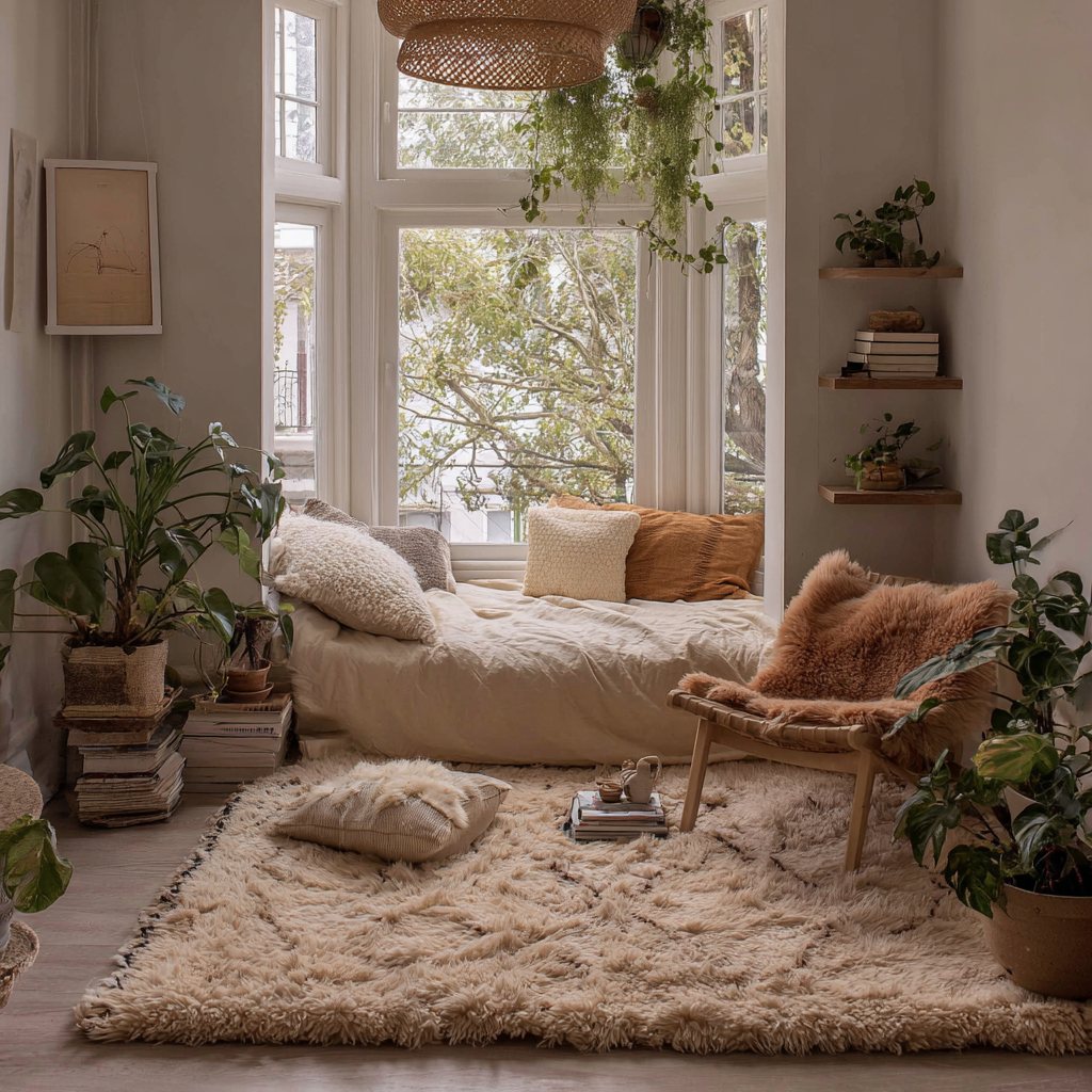
🎨 60% Dominant: Backdrop of the room — walls, large furniture, main rug. Should be neutral or calm (you see a LOT of it).
🎨 30% Secondary: Supporting elements — curtains, accent chair, throw blanket, medium decor. Contrasts but doesn’t compete.
🎨 10% Accent: The pop — throw pillows, a vase, art, candles. Bold enough to catch the eye, limited enough to not overwhelm.
Your room feels off because the ratio is off — not the colors.
The All-in-One Decor OS lets you build your 60/30/10 palette once — so every purchase either fits the ratio or gets filtered out before you spend.
Get the Decor OS →One-time purchase · Instant Notion access · Works for any rental
How Renters Apply This (When You Can’t Paint)
Your walls are probably white or off-white. You didn’t choose them. Good news: white walls ARE your 60%. You’re already halfway there. Your largest furniture (sofa, bed) completes the dominant layer in a neutral shade.
Real Apartment Examples
60%: White walls + cream sofa + jute rug | 30%: Warm wood tones + linen curtains | 10%: Terracotta — vase, two rust pillows, warm-toned art
60%: White walls + charcoal gray sofa + dark rug | 30%: Navy curtains + throw | 10%: Brass/gold — lamp, mirror, candle holders
60%: White walls + beige sofa + cream rug | 30%: Sage green curtains + plants | 10%: Mustard — pillows, a yellow print, a vase
The 3 Mistakes to Avoid
- Too many accent colors. Pick ONE 10% accent, not three. Multiple “pops” = visual noise.
- Accent color in too-large doses. An accent-colored sofa is too much. Keep it in small objects.
- Skipping the 30%. Without the middle layer, the room feels like a neutral box with a few random colorful objects.
✅ The “3 Times” test: Your accent color should appear at least 3 times in the room, spread across different areas. Three instances = intentional. One instance = accidental.
Get the Apartment Design Action Kit
Style guide, shopping filters, and a complete planning system to build a color-coherent apartment from scratch.
Get the Action Kit →